Bytestock,
rebuilt.
A refurbished-server reseller whose brand looked dated next to the hardware it actually sells. The work ran end to end: stakeholder research, a new identity, and two sites taken through to a live build.
Brief
Bytestock sells tested, warrantied refurbished server kit. The old brand didn't look the part.
The wordmark leaned on bright gradients that read as dated rather than dependable. The site carried redundant information and a confusing structure: a lot to wade through before a visitor could tell what Bytestock actually did, or trust it with a hardware order. For a company whose whole pitch is reliability, the surface was working against the product.
The brief was a full reset: a calmer, more credible identity, and two sites rebuilt around how buyers actually move from "who are these people" to "configure and order".
 Before — Logo
 Before — Website
The starting point: gradient logo, busy isometric homepage.
Discovery
Stakeholder sessions first. Assumptions last.
Structured sessions with the Bytestock team came before any sketching: how they describe themselves, who they sell to, what a good customer looks like. Three distinct buyer types kept surfacing, each deciding in its own way. Those became three personas, and an audit of the top three competitors set the baseline to beat.
IT Procurement
Data-centre Operator
SME Owner
The competitor audit showed a consistent gap: the established names were trusted but visually stale, the newer ones modern but generic, more SaaS tool than hardware specialist. The opening was a brand that looked as technical and rigorous as the product itself.
Identity
A system, not a style. Every decision earns its place.
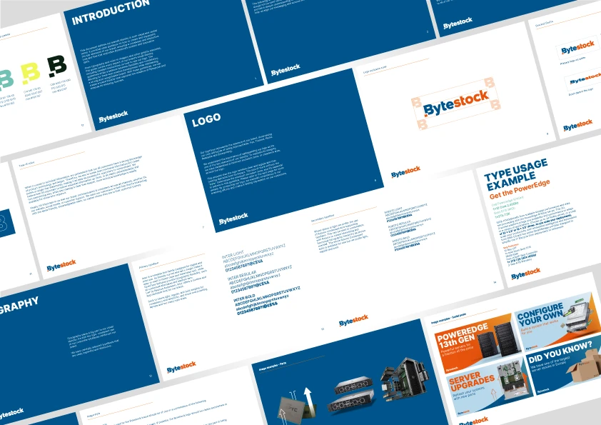
The wordmark was redrawn flat: gradient gone, the navy and orange kept and brought to full strength, the small square dot retained as the one piece of character worth keeping. Colourways were tested side by side before settling, so the mark holds up in a single colour as well as two.
Wordmark colourway exploration.
Two brand colours, sampled from the wordmark, plus neutrals.
Type moved to Inter: firm and bold at display sizes, quiet and legible in body. Weights and colour were explored the same way as the logo, by testing rather than deciding on paper.
Type exploration: Inter, across weight and colour.
Iconography replaced the old isometric illustrations with a single minimalist line set: one consistent stroke, used for navigation and categories, never as decoration.
A minimalist line-icon set, replacing the old isometric illustrations.
The Sites
Two sites, two jobs. Convince, then sell.
The brand site answers "why Bytestock?" before anyone reaches the shop: a calm enterprise pitch built around a circular-IT positioning, leading with "Redefining enterprise IT solutions worldwide", then clear proof points and a single route through to the store.
Brand site: acquisition and positioning.
The shop carries the same system into a working storefront: a "configure your own server" entry point, deals and product cards, and a structure built to hold spec-heavy procurement buyers and first-time SME buyers in the same flow.
Shop site: browse, configure, buy.
Live
The identity shipped. It's the brand running on bytestock.com today.
The flat wordmark, the navy-and-orange system, and the brand-site structure are live in production: same logo, same navigation, same "configure your own server" route into the shop. The guidelines were written to outlast the project, so the next person to touch the brand can follow it without a briefing call.
Visit bytestock.com ↗