Arnold Lodge
Redesigned.
A website redesign for an independent school in Leamington Spa: from a day of on-site research, through three creative directions, to a chosen concept and a working prototype. The direction shown here is the one that shipped.
The Brief
The brief
A school with a clear identity.
And a website that had stopped showing it.
Arnold Lodge is a co-educational independent school in Leamington Spa, for pupils aged 4 to 18. For a school like it, the website is the first conversation with a parent, usually long before any visit. The existing site had aged out of step with the place: dated where the school felt warm, flat where it felt full of energy.
The redesign was scoped as a research problem before a design one. The work began on site, not in software.
The Visit
Discovery
Discovery started on site.
Not on a screen.
A day at the school did the early work. Walking the grounds and the classrooms surfaced the raw material the brief needed: children's work pinned across the walls, international flags, and a school that wore its identity openly.
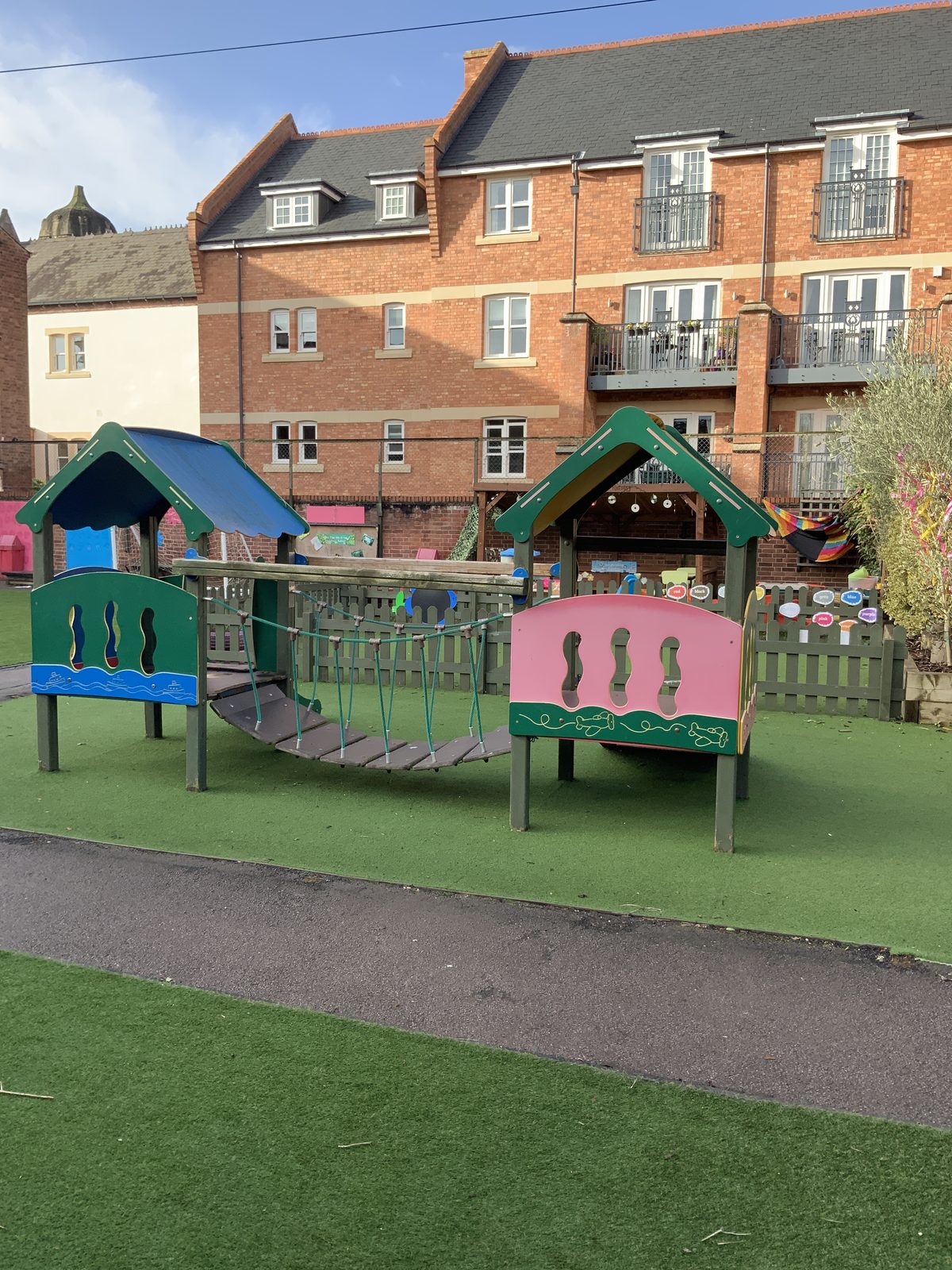
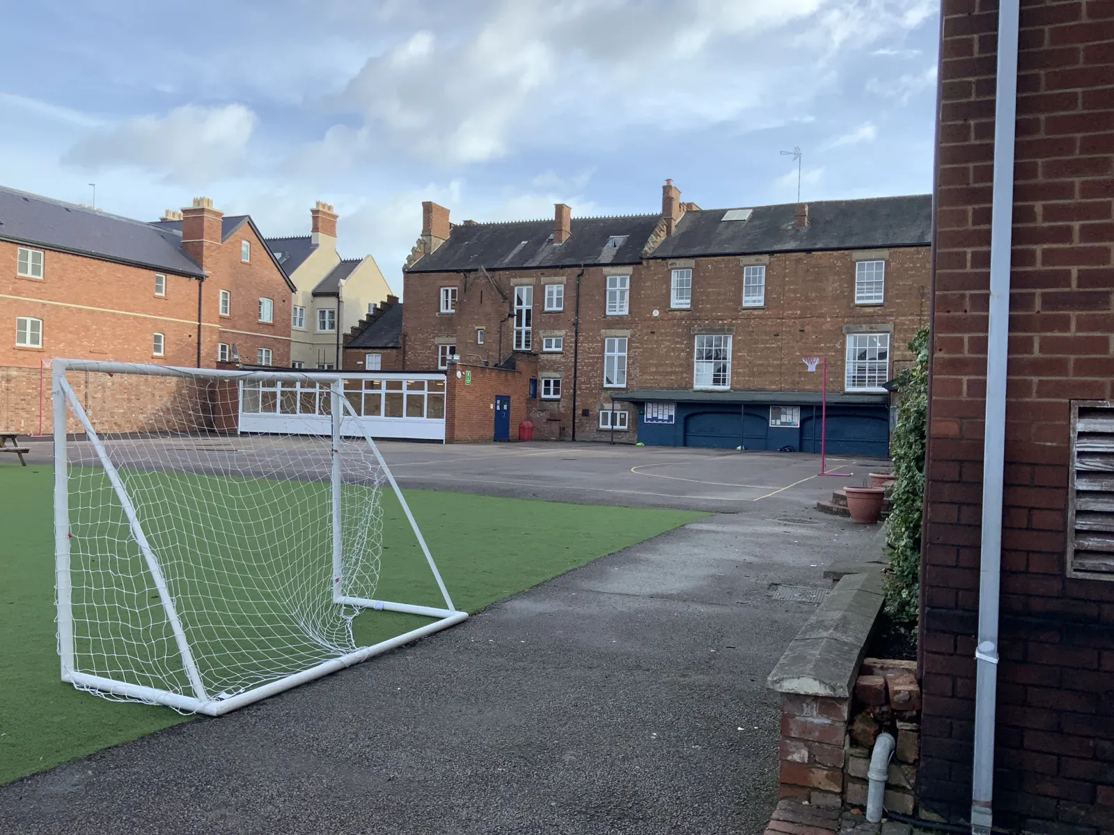
The grounds. A compact Victorian campus, equal parts heritage and busy, active school.
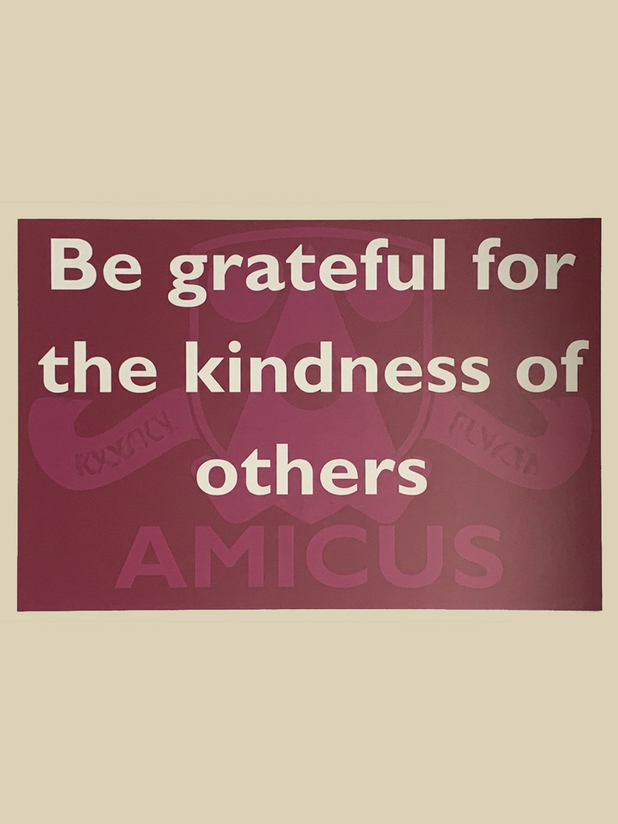
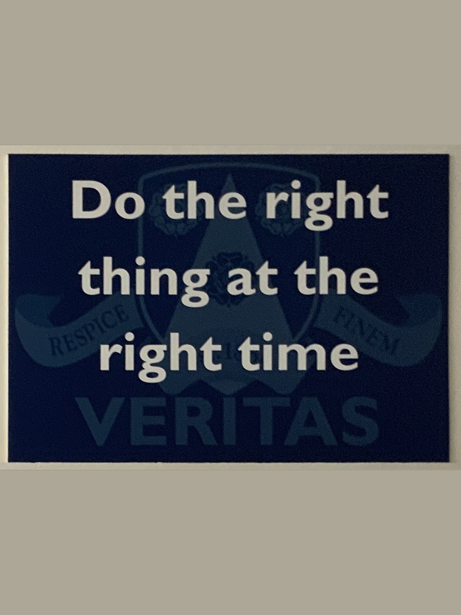
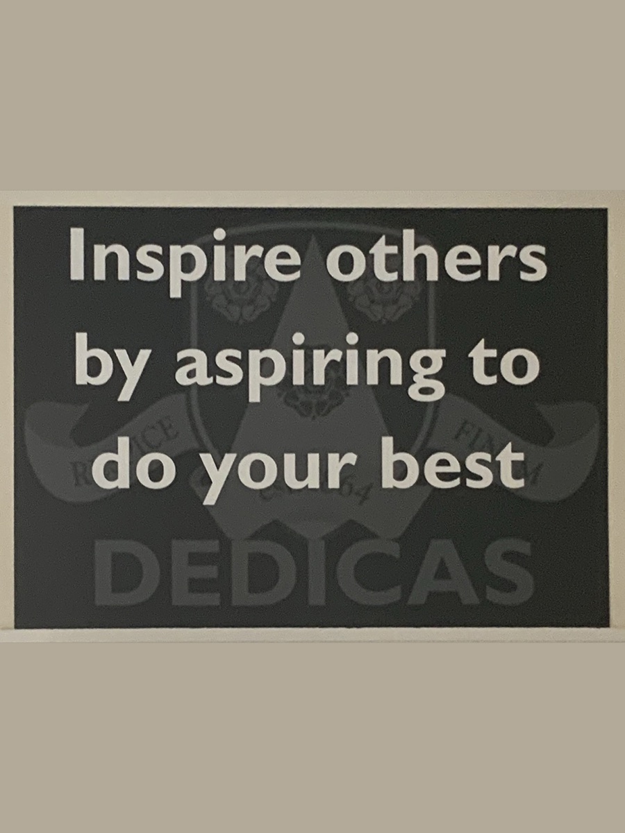
Nowhere was that identity more visible than the house system. Three houses, each carrying a one-word value and a mantra to live it by, printed on signs throughout the building. The school already knew exactly what it stood for. The website was the only place not saying it.
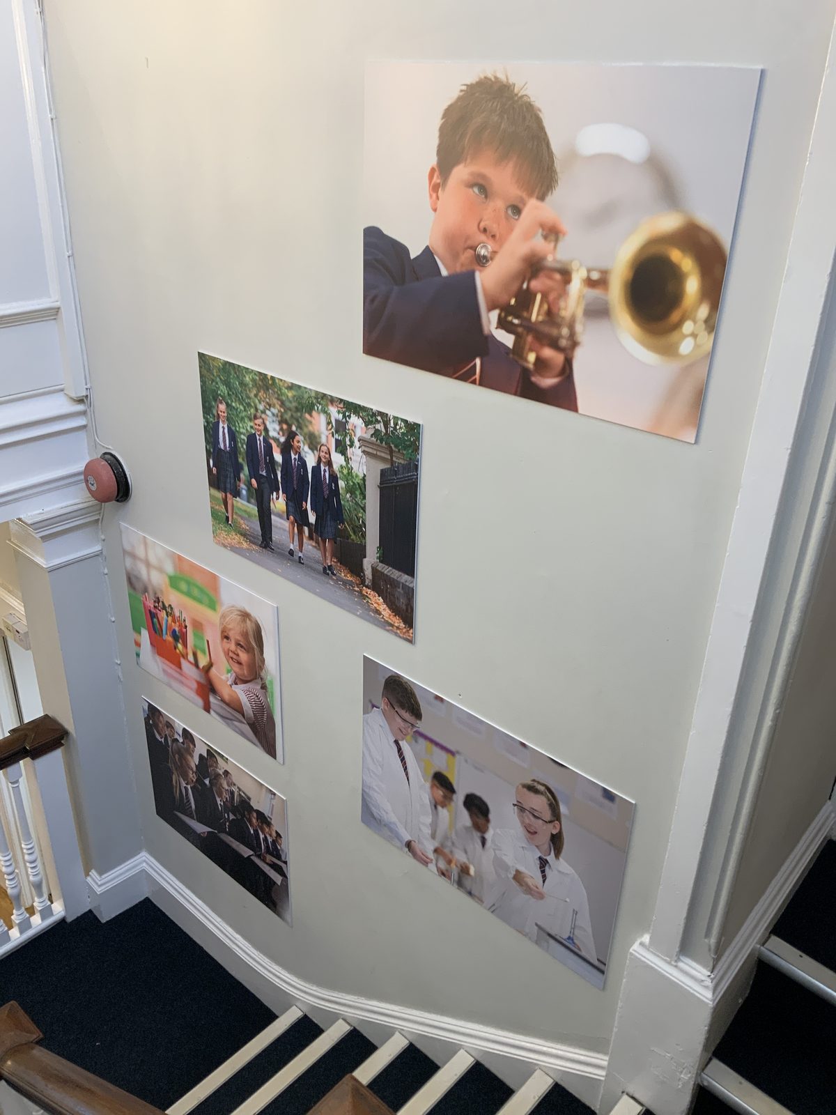
The walls said something else, too. They were lined with real pupils: a boy mid-trumpet, kids in lab goggles, a team walking in. Honest, full of character, nothing like stock. That wall set the direction for everything that followed.
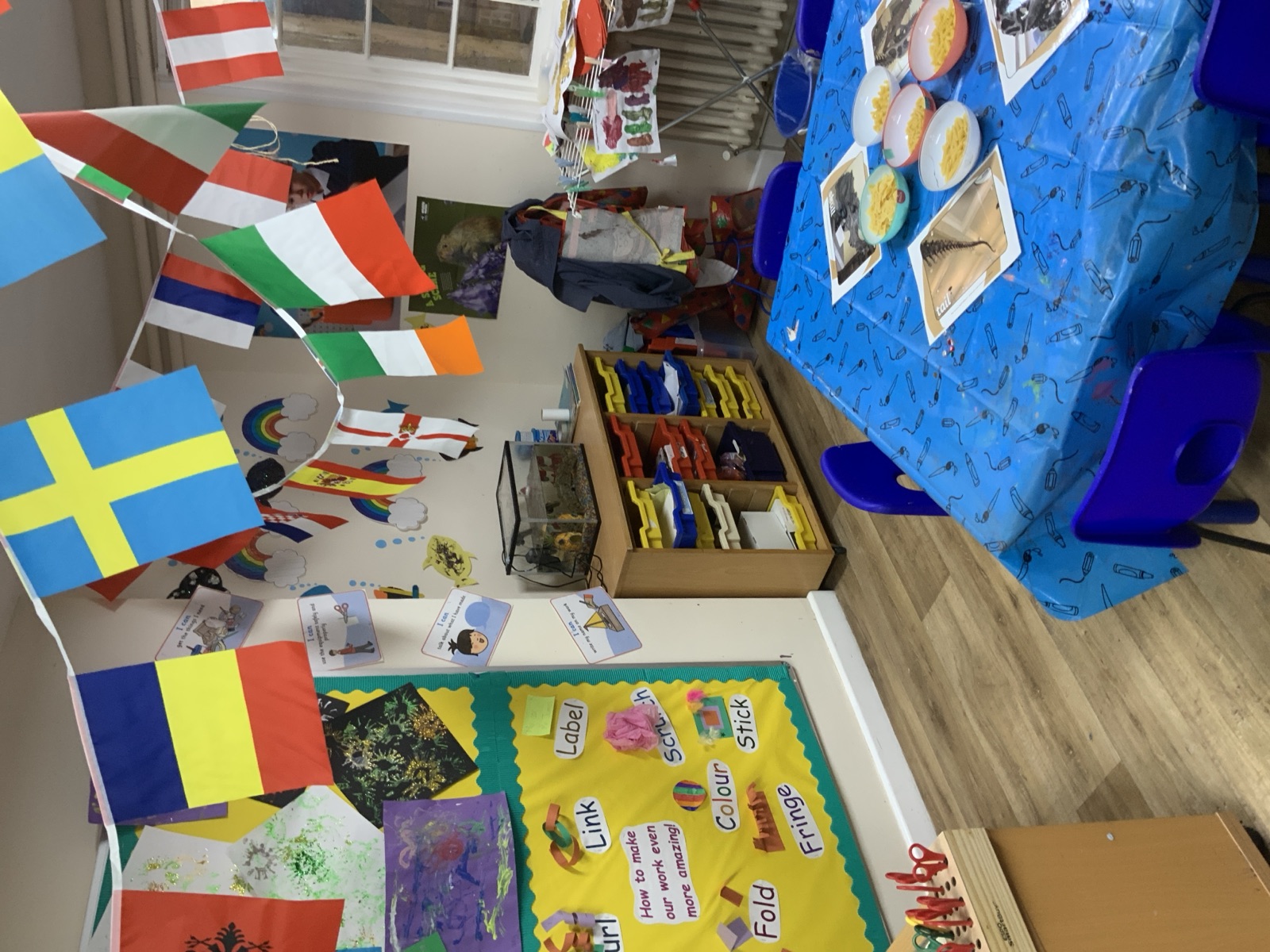
A day of observation condensed into pages of notes: what the school needed to say, who it needed to reach, and the shape the site could take.
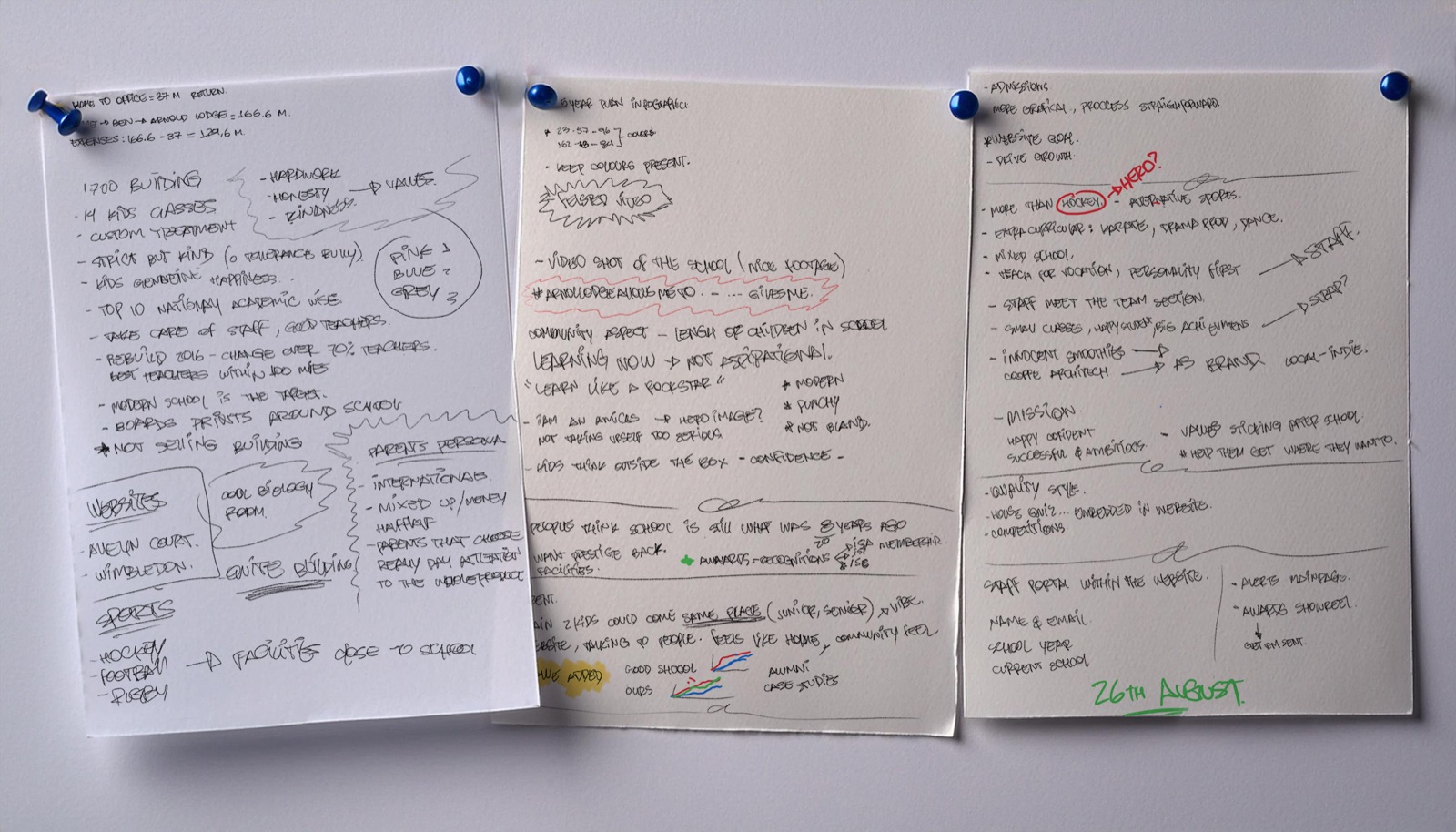
Notes from the day. Early structure and content thinking, dated on the visit itself.
Three Directions
Exploration
Three directions, one decision.
Presented as a real choice.
Three moodboards translated the research into three genuinely different stances. Each was put to the school as a real decision about what it wanted to project, not three safe variations of a single idea.
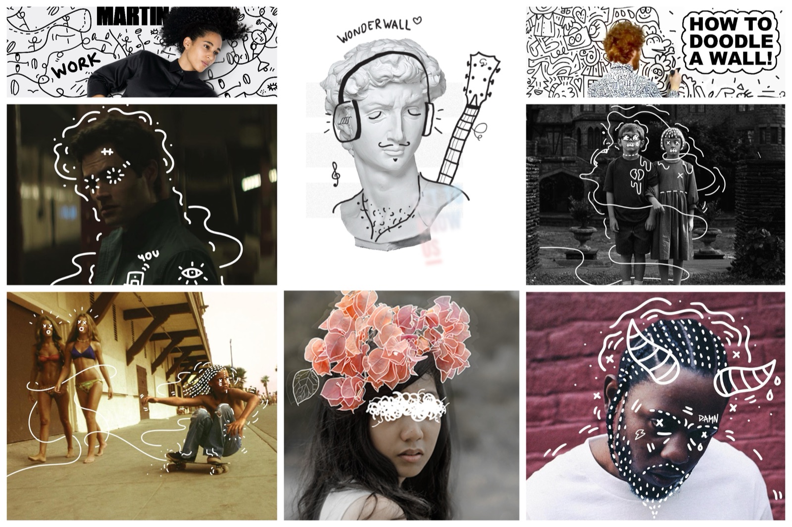
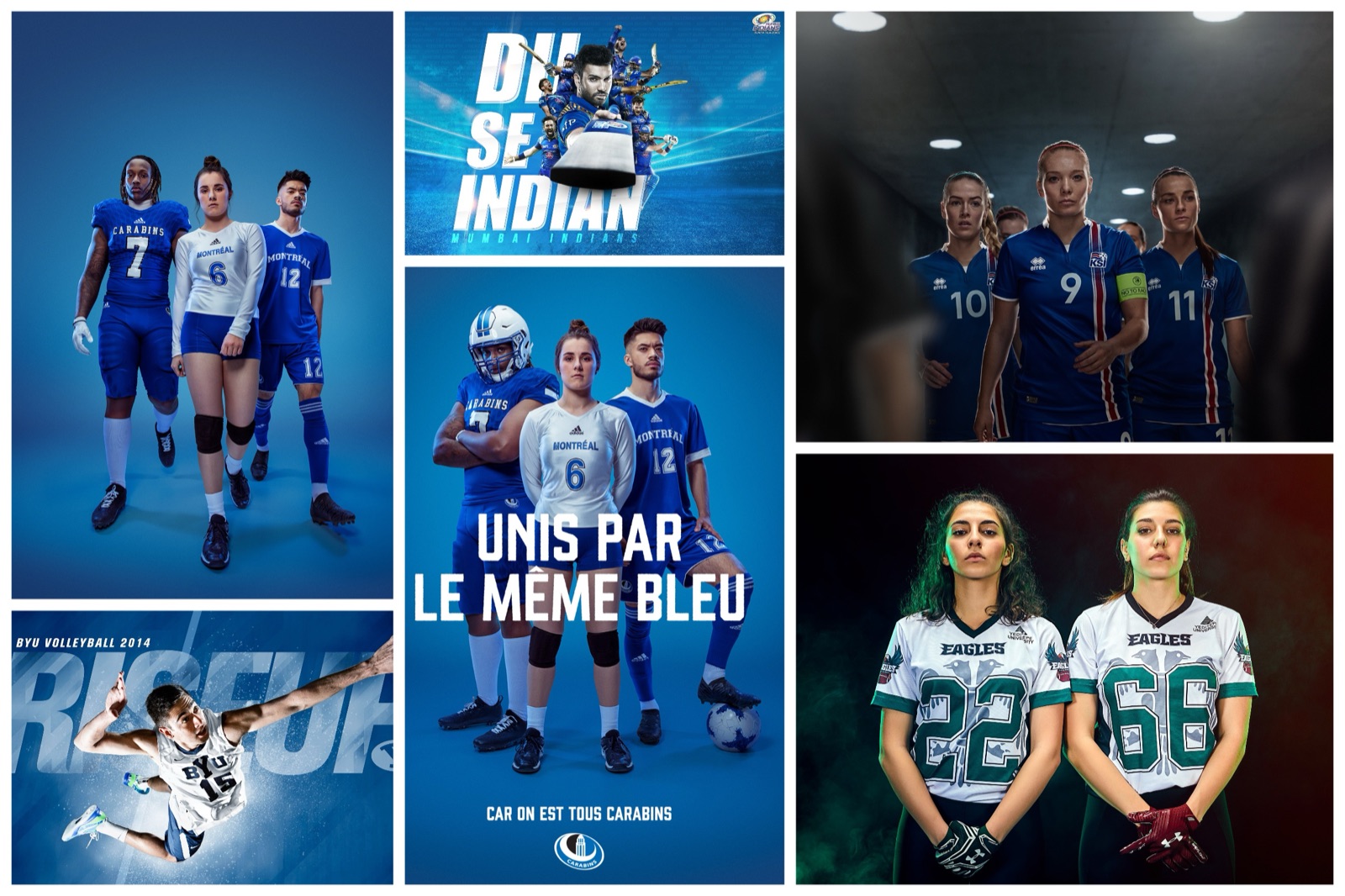

The strongest idea sat between two of them: the confidence of hero photography with the personality of illustration drawn straight onto it. That fusion became the concept.
The Concept
The big idea
The pupil as the hero.
The values built into the message.
The concept made real pupils the protagonists, photographed with the confidence of the hero direction, then brought to life with illustration drawn on top: crowns, scribbles, energy. It tied directly back to the house values and gave the school a line it could complete in its own words.

The creative document presented to the school. The fill-in-the-blank line, the pupil-as-hero treatment, and the illustration layer that gives it character.
The Prototype
Making it move
From a look
to a working behaviour.
An interactive wireframe prototype turned the concept from a look into a behaviour. The homepage cycles the school's values through the headline ("Arnold Lodge lets me be creative"), full-screen sections respond to the arrow keys, and the navigation is rebuilt around what a parent actually needs: Contact, Visit, Apply.
The interactive prototype, the final deliverable before the project moved into production.
Live
What shipped
The concept that shipped.
Still live today.
The direction held. The website Arnold Lodge runs today is built on the same idea: the pupil as the hero, the values carried in the message. The fill-in-the-blank line became the school's own. The live homepage opens on "ALS lets ME, Achieve, Create, Believe, Be Me," a direct descendant of the concept presented here.